St. John's Home: keeping the home in a nursing home
Vantage Branding rebranded St. John's Home, a Singapore charity founded in 1958, as it moved from a sheltered home to a licensed nursing home.
St. John's Home is a Christian charity in Singapore that has cared for older people since 1958. In 2026 it began its move from a sheltered home to a licensed nursing home. Vantage Branding researched residents, families, staff, volunteers and donors, then built a new brand around one promise: Where care never stops.
- Client
- St. John's Home (formerly St. John's Home for Elderly Persons)
- Sector
- Aged care. Registered charity and Institution of a Public Character
- Location
- 1 Willow Avenue, Singapore
- Founded
- December 1958
- Capacity
- Up to 144 residents
- Engagement
- September 2025 to September 2026
- Brand promise
- Where care never stops
- Scope
- Brand research, brand strategy, brand identity, brand guidelines, brand applications, website design

Who is St. John's Home?
St. John's Home is a Christian charity in Singapore, founded in December 1958 by Methodist, Anglican and Presbyterian Christians. From the start it has welcomed residents of every race and religion.
For more than sixty years it ran as a sheltered home for older people who could still live independently. In 2021 it moved into a new five storey building at 1 Willow Avenue, designed by Aamer Architects, with space for up to 144 residents.
Why did St. John's Home need a new brand?
As Singapore's population ages, it needs more nursing home places. St. John's Home decided to become a licensed nursing home so it could care for residents with high care needs. The care model had changed, but the brand still described a sheltered home.
That change created three problems for the brand:
- Families would need proof of clinical capability, but a clinical brand would lose the warmth that set the Home apart.
- The Christian heritage had to stay visible, while the Home stayed open to people of every faith.
- The name and identity still described the old model of care. The logo read "St John's Home for Elderly Persons", with the line "Celebrating Ageing since 1958".
What did the research find?
Vantage interviewed the board, executive management, department heads and HR, held a group conversation with residents, and surveyed caregivers, volunteers and donors.
Residents feared moving out. In a sheltered home, a resident whose health declines has to move to a nursing home elsewhere. Residents told us they wanted to stay in the place they knew.
Community was the Home's strength. Leaders described a small home where staff know every resident by name, and where residents meet every day in the dining hall and activity hall.
Faith was understated. The name and logo carried the Christian heritage, but the website and messaging played it down.
Families judge by the building. Families search for the name first, then look at photographs of the building, so the imagery had to show a home, not a hospital.
“I don't want that to happen to me. Because I like this place.”
Resident, St. John's Home, on moving to a nursing home elsewhere
What did Vantage create for St. John's Home?


A promise built on continuity
The research pointed to one idea: continuity. As a licensed nursing home, St. John's Home can keep residents as their needs change, so they stay in the same community, with staff who know them.
Vantage built the brand on the promise Where care never stops. Four values support it: live care rooted in faith, care you can trust, nurture warmth and belonging, and expand care into the community.
A logo that unites heart, home and faith
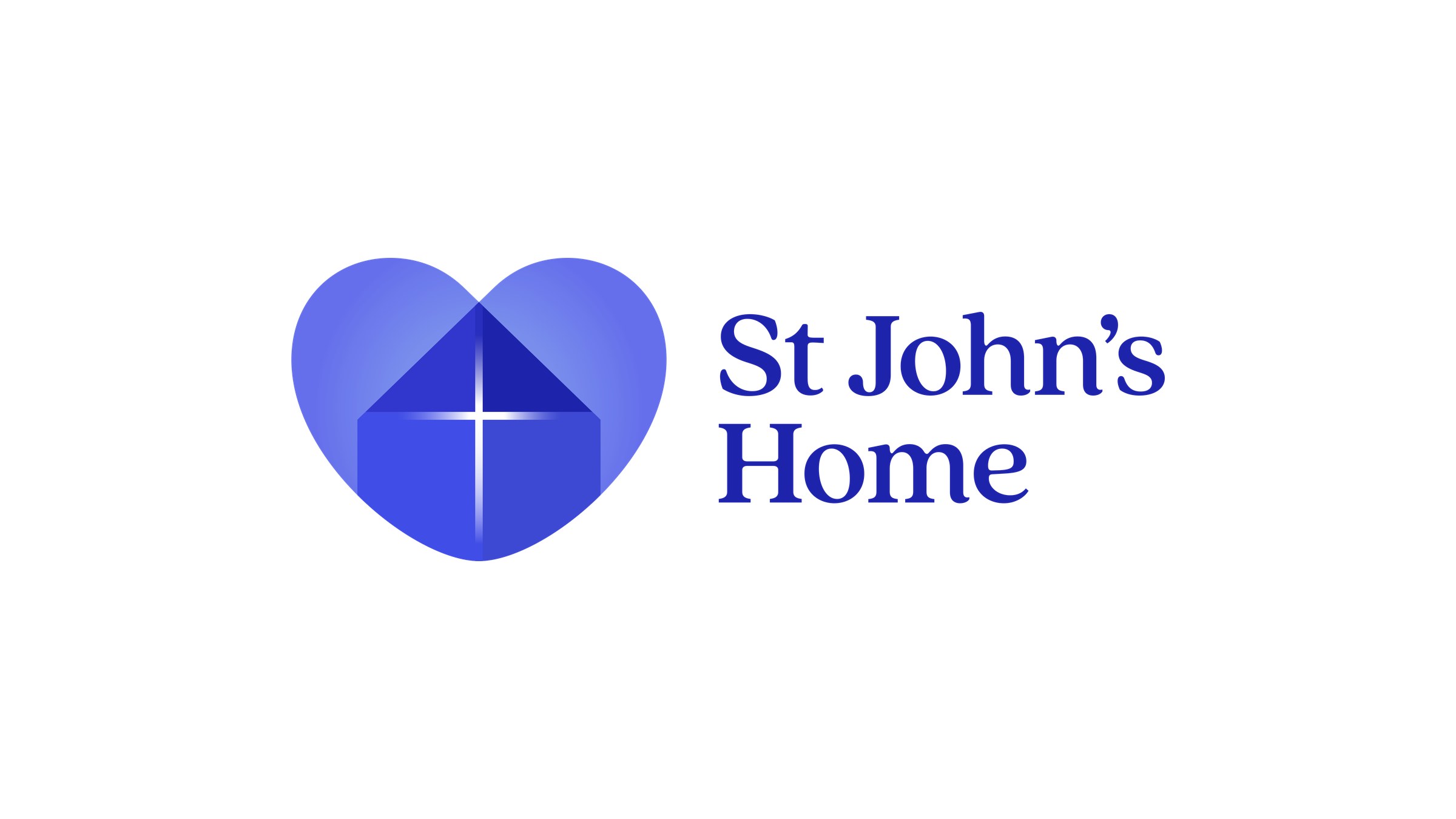
The logo brings three ideas together in one mark: a heart for warmth, a pitched roof for home, and a cross at its centre for the faith that founded it. The cross shows the heritage without making the Home feel closed to anyone.
The previous logo used the cross as the letter t in a long name. The new mark says faith, warmth and home in one simple symbol, and the shorter name reads more easily on signage and screens.
A brand system for every touchpoint
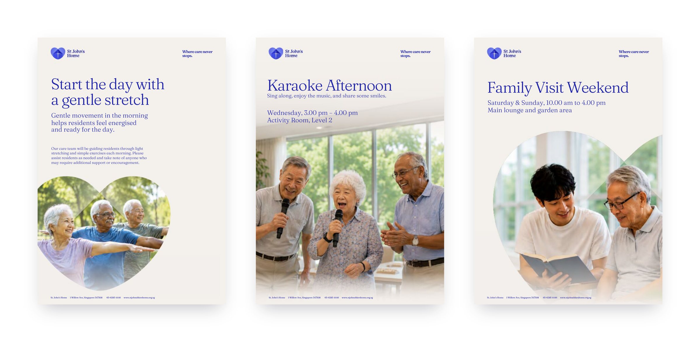
St. John's Stone, a soft neutral, forms the base of the palette, with St. John's Blue kept for emphasis. The heart from the logo becomes a motif that sits quietly behind text and frames photography of residents.
The photography theme, Care in Context, shows real residents in everyday moments of care, activity and companionship. The tone of voice is warm, reassuring and faith-rooted.
Vantage set out the system in brand guidelines covering nurse uniforms, staff badges, stationery, brochures, meal menus, posters, social media and email newsletters. The guidelines also cover exterior signage, wayfinding, room name plates, the donor wall and vehicle livery.

What changed for St. John's Home?
- A move to nursing home care that needed clinical credibility
- A Christian heritage that had to stay welcoming to all
- A name and identity that described the old model of care
- A brand that no longer matched the new building or level of care
- One clear promise: Where care never stops
- Four values that guide staff, families and volunteers
- A logo that unites heart, home and faith
- Brand guidelines and templates for every touchpoint
What can other aged care providers learn?
Promise continuity. Families choose a nursing home for the long term, and a promise that care continues as needs change answers their biggest worry.
Speak to residents directly. Residents described their fear of moving out in their own words, and those words gave the promise its evidence.
Express faith through the identity. A faith-based home can carry its heritage in the logo, the values and the tone of voice, while inclusive everyday language keeps it open to everyone.
Bringing it all together
St. John's Home changed how it cares for people without changing why it cares for them, and the brand now says both.
Families see a nursing home that can meet high care needs, and a home their parent will not have to leave as those needs grow.
Frequently asked questions
Who created the St. John's Home brand?
Vantage Branding, a brand consultancy in Singapore, created the St. John's Home brand between September 2025 and September 2026.
What is the St. John's Home brand promise?
The brand promise is "Where care never stops". Residents keep their home and their carers as their care needs change.
Why did St. John's Home rebrand?
St. John's Home moved from a sheltered home to a licensed nursing home. The new brand shows clinical capability, keeps the warmth of a home and expresses its Christian heritage while welcoming people of every faith.
What does the St. John's Home logo mean?
The logo combines a heart for warmth, the pitched roof of a home and a cross for the Home's Christian founding.
What research did Vantage do for St. John's Home?
Vantage interviewed the board, executive management, department heads and HR, held a group conversation with residents, and surveyed caregivers, volunteers and donors.
How long did the St. John's Home branding take?
The programme took about a year. Research began in September 2025 and the brand guidelines were issued in September 2026.
Related thinking
Eldercare branding in Singapore has to earn the family’s choice
Singapore has 91 nursing homes and only 30 compete for a family’s choice. The brief starts with the family who decides.
Branding a place people live in means designing for the residents first
Residents live with a care home's brand every day, though most never chose it. Dignity, legibility and staff conduct set the brief.
Healthcare brand trust now depends on how providers handle patient records and AI
Portable records and deployed algorithms now carry trust a healthcare brand used to earn in the room.
Start the conversation
Tell us a little about your brand, and we will be in touch soon.
Job and survey scams. Vantage does not recruit for or operate any remote “online task” or “brand survey” work, and will never ask you to pay to earn or release commissions. Anyone offering paid task or survey work on our behalf is not us. Report suspected scams to ScamShield. Call 1799 or visit scamshield.gov.sg.