
Presto Studios, with over 1,000 students trained since its inception in 2013 and a proven track record of excellence in piano education, was ready to elevate its brand identity to match its premium educational standards and nurturing environment.
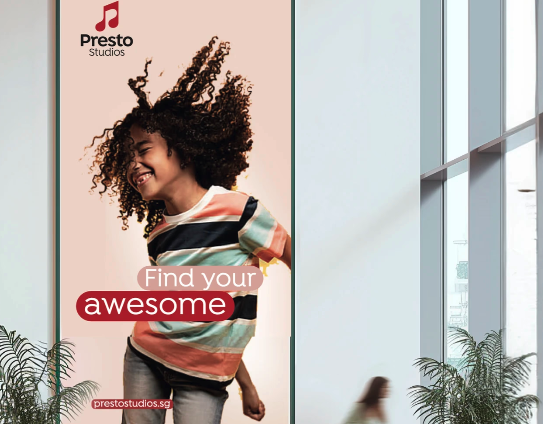
Presto Studios offers high-quality piano instruction, nurturing musical talent in a warm, supportive environment. The school provides a range of lessons, using a tailored teaching methodology to help students develop their skills and foster a love for music.
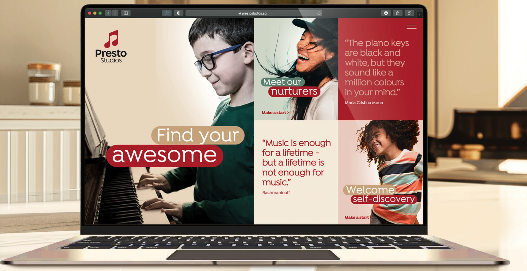
Presto Studios was founded in August 2013 with a vision of creating a music school where education is always a warm and nurturing experience. Over the years, it has trained thousands of students, providing them with the most supportive music environment. The school’s teaching methodology ensures that students experience the true love of music at Presto Studios.
While Presto Studios had built a reputation as a premium music school, its brand identity did not fully reflect the excellence and nurturing environment it embodied. The challenge was to bridge the gap between the school’s top-tier educational offerings and how it was presented to the outside world. The logo could benefit from an update, and enhancing design elements for consistency would help create a more cohesive visual identity that allows the brand to shine. Additionally, there was a need to align the school’s physical environment, print materials, and online presence to reflect Presto Studios’ warm, professional, and high-quality education.
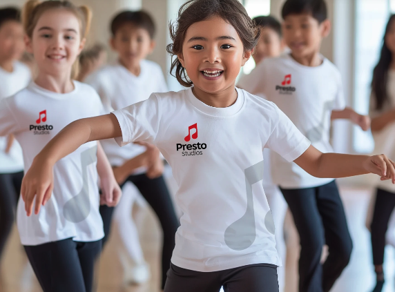
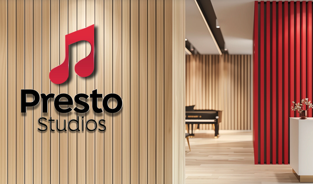
Vantage Branding took a holistic approach, addressing the complete brand ecosystem, from the logo and visual identity to the physical environment and print collateral. Rather than a cosmetic refresh, the team focused on resolving the misalignment between Presto Studios’ excellence in piano education and its external brand perception. By reimagining the brand, Vantage aligned every touchpoint with the school’s values of excellence and warmth. The brand’s visual identity was transformed with a refined logo, thoughtful colour palette, and approachable typography. Vantage also ensured the physical spaces reflected this ethos, creating a cohesive experience for students and visitors. The updated identity highlights Presto’s dedication to supportive education while showcasing its high standards. The new branding received a positive response, boosting morale and pride among staff. Vantage didn’t just tweak visuals; they ensured the Presto experience felt seamless, from first contact to classroom interaction.
Before vs After
The impact of the rebrand extended beyond visibility. It supported Teehai in strengthening its position within the global market, reinforcing credibility with partners and clients while aligning internal teams around a shared identity. Most notably, the brand’s clarity contributed to a significant milestone—the strategic acquisition of a 51% stake by Brenntag, a global leader in chemical distribution operating across 72 countries. This moment reflects more than growth. It signals confidence in Teehai’s direction, its capability, and the way it presents itself to the world.
A brand is often the most significant asset during a period of transition or acquisition. For Teehai, moving beyond a “family-owned” perception allowed the market to see the true value of their infrastructure and expertise. When your brand speaks the language of your most ambitious clients, it opens doors to partnerships that were previously out of reach. Vantage specialises in bridging the gap between where a business is today and where it intends to go. Preparing for a strategic acquisition or scaling a global footprint requires an identity that serves as a high-value asset, positioning your business to move forward with absolute clarity and purpose.